Ghembule: A Bold Modern Typeface for Digital Branding
There’s that moment—right after you’ve finalized the hero section of a new coaching website—when you step back, squint at the screen, and ask yourself: “Does this headline *feel* like the brand?” I’d been testing several display fonts against a soft gradient background and clean sans-serif body text when Ghembule landed in my project folder. Within minutes, I swapped it in for the H1—and suddenly, the whole page exhaled. Not louder, not busier—but bolder, warmer, more authentically human.
What Ghembule Brings to the Screen
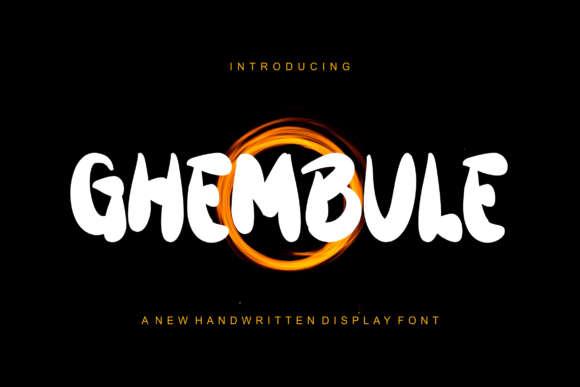
Ghembule is a premium modern display font from Script Amp—a category that often leans ornate or overly stylized, but Ghembule avoids both traps. It’s bold without being aggressive, authentic without sacrificing clarity, and distinctly contemporary while nodding to hand-drawn confidence. The letterforms have subtle contrast, confident terminals, and just enough personality to feel intentional—not algorithmic. It’s not a script font in the looping, cursive sense; it’s a strong, grounded display typeface with rhythmic spacing and generous x-heights that hold up beautifully on screen.
I tested Ghembule across real web contexts: a boutique online store’s banner, a course sales page headline, a portfolio site’s “Work” section title, and even as a decorative accent over a muted image carousel. In every case, it anchored the visual hierarchy without competing with imagery or overwhelming content. Its weight and structure give digital interfaces instant gravitas—especially when paired with a neutral, highly legible sans serif like Inter, Poppins, or Manrope for body copy and UI elements.
Responsive Behavior & Real-World Readability
One of my first checks was mobile rendering. I loaded the font on a live test page and scrolled through iPhone and Android previews. Ghembule scaled cleanly down to 28px on headings—even at 24px in tight hero layouts, it remained legible and impactful. That’s rare for display fonts, which often blur or collapse at smaller sizes. The key? Thoughtful letterfit and open counters. No awkward collisions, no cramped ascenders/descenders, and no need for excessive tracking adjustments on responsive breakpoints.
It performs especially well over light or dark backgrounds—no haloing, no thin strokes disappearing into noise. I used it over a textured photo banner (with subtle CSS backdrop-filter) and found it held its own without needing heavy text shadows. For accessibility, I kept it strictly for headings and short decorative phrases—not navigation, form labels, or paragraph text—and paired it with WCAG-compliant body fonts. That balance preserved both aesthetic impact and usability.
Where Ghembule Shines Online
This isn’t a font for everything—but where it lands, it lands with intention. Here’s how it played out in actual projects:
- Landing pages: Used for primary headlines and subheads—paired with a clean medium-weight sans serif for bullet points and CTAs. Conversion-focused pages felt more confident, less generic.
- Portfolio sites: Applied to project titles and category headers. Added visual rhythm between image grids and descriptions without demanding attention away from the work itself.
- Digital brand kits: Included as the “hero voice” in downloadable assets—perfect for social banners, email headers, and presentation slide titles where brand tone needs to be instantly recognizable.
- Course and offer pages: Deployed in section dividers (“What You’ll Learn”, “Your Journey Starts Here”)—giving structural warmth to otherwise functional content.
- Blog headers: Used sparingly for featured post titles or newsletter banners—not body text, but as a signature touch that signals editorial care.
Smart Pairing & Practical Considerations
Ghembule thrives when contrasted—not matched. I consistently paired it with a simple, highly readable sans serif for all functional text: navigation, buttons, captions, and paragraphs. For a slightly more editorial feel, a restrained serif like Lora or Playfair Display worked beautifully for blog titles or quote blocks—while keeping Ghembule reserved for top-level branding moments.
Before implementing, I checked what was included: multiple weights (Regular, Bold, Black), OpenType features like stylistic alternates and ligatures, and robust multilingual support—including extended Latin characters. All file formats were present (WOFF2, WOFF, TTF), and the license explicitly covers commercial web use—critical for client sites, SaaS dashboards, and online stores. No surprises, no last-minute licensing panic.
When to Reach for Something Else
Ghembule isn’t built for long-form reading, fine print, or interface-heavy applications. I avoided it for:
- Navigation menus (too bold for repeated scanning)
- Form fields and error messages (clarity over character)
- Small-screen tab bars or footer links (legibility suffers below 16px)
- Dense dashboard layouts where speed and neutrality matter most
It’s also not ideal for pure minimalism—if your brand voice is “quiet luxury” or “clinical precision,” Ghembule’s warmth may feel too present. But for creative entrepreneurs, makers, coaches, and small brands building digital presence with heart and intention? It adds unmistakable texture—without sacrificing polish.
What makes Ghembule stand out in the Fonts landscape isn’t just its design—it’s how thoughtfully it bridges expression and function. It doesn’t shout. It states. And in a feed-saturated, scroll-happy world, that kind of quiet confidence is exactly what makes a brand memorable.